Cellier

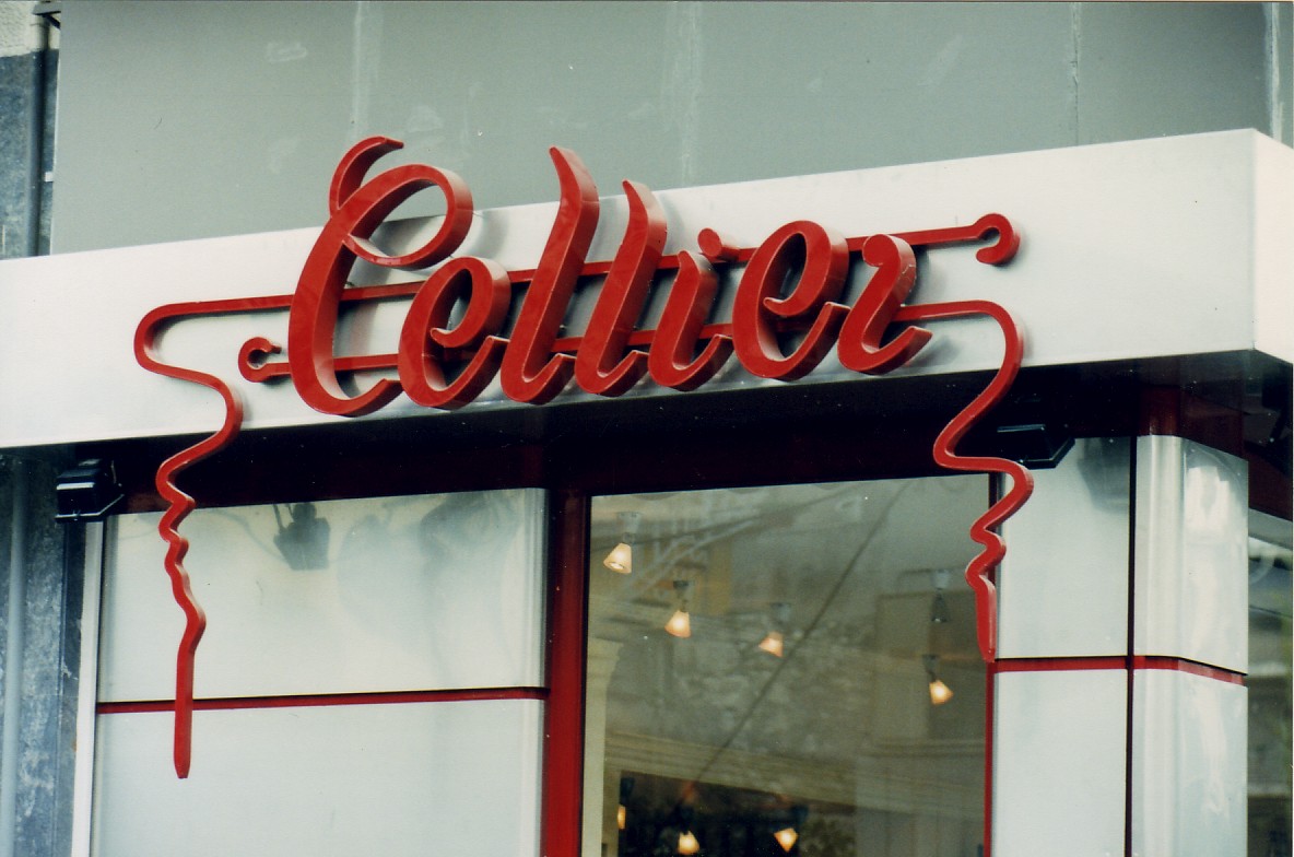
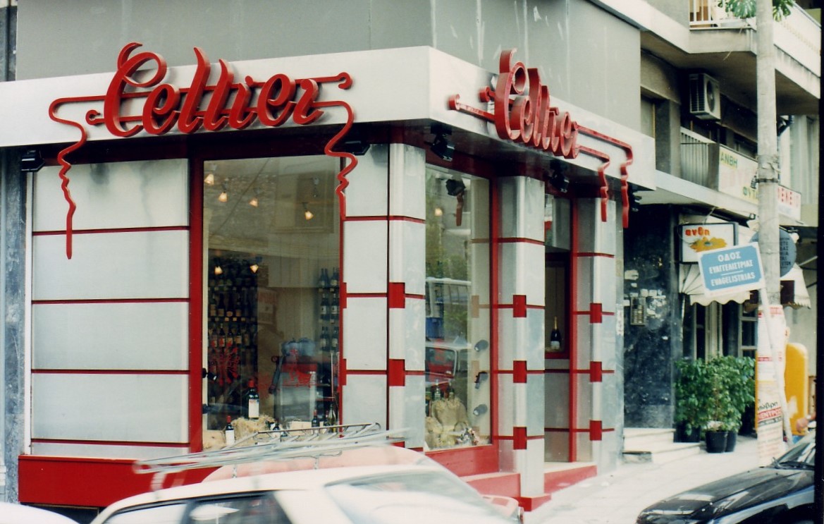
Capturing the sleek commercial aesthetic of the 1990s, this renovation of the Cellier wine boutique pairs brushed metallic paneling with bold red architectural banding, cleverly integrating the brand's iconic cursive logo directly into the storefront's geometric design.

Facade & Interior
|
Athens
|
1988
Facade & Interior
Location
Athens
Category
Facade & Interior
YEAR
1988

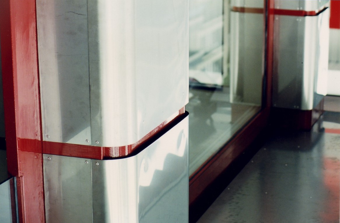
Executed in the 1990s, the Cellier renovation perfectly captures the era's shift toward sleek, high-contrast commercial architecture. Tasked with revitalizing both the facade and the interior of this premium wine boutique, we designed a striking exterior that commands attention on the street level. The storefront features a bold, geometric composition of curved, brushed metallic paneling sharply punctuated by vibrant red architectural banding. This grid-like framework not only lends the facade an air of polished, late-20th-century sophistication but also serves to perfectly frame the expansive display windows, creating a highly transparent threshold that invites the city directly into the space.

At the heart of this exterior transformation is the masterful integration of the brand's iconic red logo, which acts as both dynamic signage and a structural design element. The elegant, three-dimensional cursive script sits proudly on a crisp white fascia, with its stylized red lines cascading gracefully downward to frame the upper glass panes. This bold, graphic branding transitions seamlessly into the interior, which was completely reimagined to complement the facade’s structured aesthetic. Inside, warm, focused lighting and clean, organized shelving offset the cool metallic exterior, ensuring that while the architecture makes a definitive 90s statement, the curated selection of wines remains the true focal point of the retail experience.
Δημιουργήθηκε όχι με βάση το μπάτζετ, αλλά από την κοινότητα.

At the heart of this exterior transformation is the masterful integration of the brand's iconic red logo, which acts as both dynamic signage and a structural design element. The elegant, three-dimensional cursive script sits proudly on a crisp white fascia, with its stylized red lines cascading gracefully downward to frame the upper glass panes. This bold, graphic branding transitions seamlessly into the interior, which was completely reimagined to complement the facade’s structured aesthetic. Inside, warm, focused lighting and clean, organized shelving offset the cool metallic exterior, ensuring that while the architecture makes a definitive 90s statement, the curated selection of wines remains the true focal point of the retail experience.